1.Hokusai’s bold and unconventional use of perspective
Much of the acclaim surrounding this series comes from the strikingly original compositions in each print. But Katsushika Hokusai (葛飾北斎) had another trick up his sleeve: he masterfully employed perspective to make each scene even more impactful.
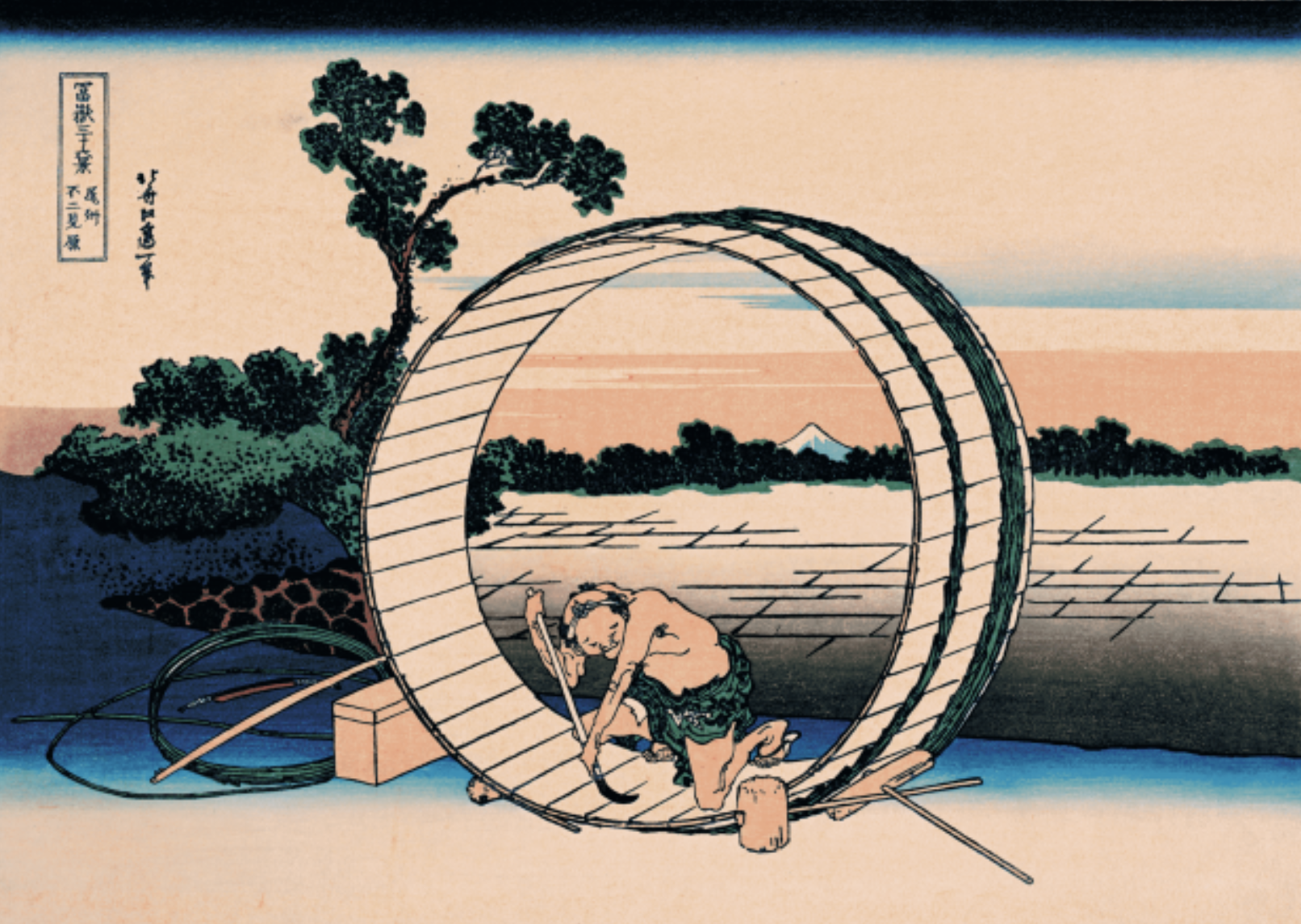
‘Fugaku Sanjurokkei (冨嶽三十六景) : Bishu Fujimigahara (尾州不二見原, Fuji Seen from the Province of Bishu)’
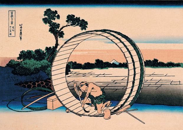
In this depiction of a scene from Bishu (尾州), Mount Fuji is shown small and pale in the distance. The large barrel, meanwhile, is tilted at an angle, yet the cooper and the front of the barrel appear straight-on — a deliberate ambiguity in perspective. Still, the circular rim of the barrel acts like a frame, giving the distant Mount Fuji a strong presence despite its size. The blend of different perspectives enhances the overall impact of the image. Hokusai’s daring manipulation of visual space is nothing short of genius.
2. Small but commanding – the power of white
In many prints, Mount Fuji appears small in the background — yet it draws the eye immediately. The secret? The colour white. This does not signify snow-capped peaks, but rather is one of Katsushika Hokusai’s unique ideas—using white effectively to highlight areas he wanted to emphasize.
3. Framing that feels almost photographic
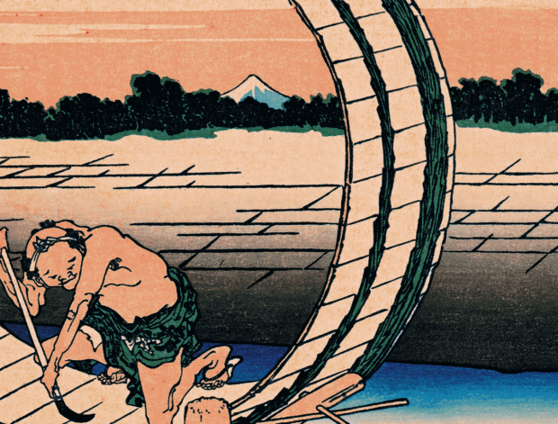
The round rim of the barrel, positioned nearly at the centre of the composition, acts as a visual frame that accentuates the presence of distant Mount Fuji. It also serves to guide the viewer’s gaze from the cooper — who initially draws attention — towards the true subject: the mountain beyond.
4. A colour palette unlike any seen in ukiyo-e before
South Wind, Clear Sky captures Mount Fuji bathed in red light for a fleeting moment under a warm early-summer morning breeze from the south — hence the alternative name ‘Red Fuji (赤富士).’ It is one of only two prints in the Thirty-six Views of Mount Fuji series that show the entire mountain, the other being Rainstorm Beneath the Summit. Alongside The Great Wave off Kanagawa, it helped secure Hokusai’s global reputation.
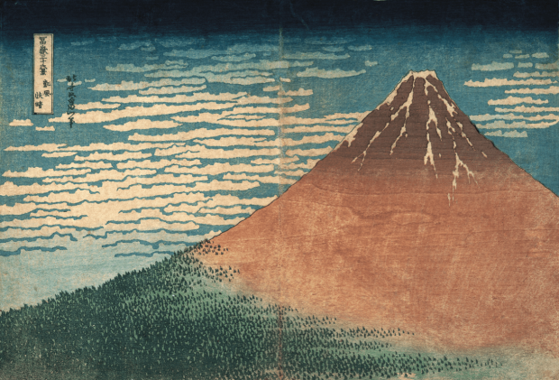
‘Fugaku Sanjurokkei (冨嶽三十六景) : Gaifu kaisei (凱風快晴, South Wind, Clear Sky)’
The image’s dramatic impact lies above all in its daring use of colour. The red-tinged slope of Fuji, the deep blue sky streaked with mackerel clouds, and the foothills rendered in a greenish hue using techniques like pointillism and gradation printing — all come together in a seemingly simple composition of just three colours. Even among the richly coloured nishiki-e (錦絵) prints of the time, this work stood out vividly and was met with amazement abroad.
5. ‘Prussian Blue’ – The Hokusai Blue that captivated the world
Particularly striking is the crystal-clear blue of the sky. This was achieved using an imported synthetic pigment from the West: Prussian Blue, more commonly known in Japan as bero-ai (ベロ藍). The brilliance of Thirty-six Views of Mount Fuji owes much to the arrival of this newly developed overseas pigment.
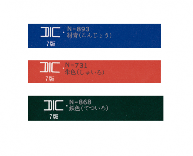
ThePrussian Blue sky, sharply contrasted with the white mackerel clouds, enhances the sense of clarity. The mountain’s slopes are lit in red gradients, while the forested base is rendered with a mix of pointillism and bokashi-zuri (ぼかし摺り, woodblock printing technique creating soft color gradients). Remarkably, Hokusai evokes a profound depth and resonance with just three colours — a testament to his technical mastery. Incidentally, bero-ai takes its name from Berlin, where the pigment was originally produced.
*Colour references based on editorial research.
This article is translated from https://intojapanwaraku.com/rock/art-rock/1093/