A bold, never seen before color composition!
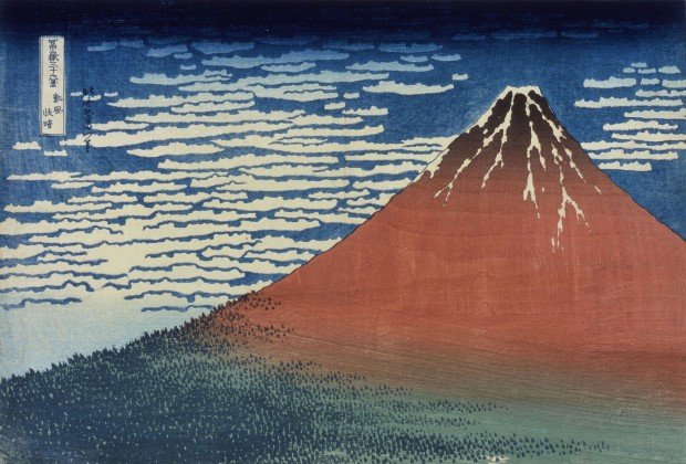
 Katsushika Hokusai, “South Wind, Clear Sky” (also known as “Red Fuji”) from the series the Thirty-six Views of Mount Fuji, 1831~1833, horizontal, oban-sized polychrome woodblock print, Sumida Hokusai Museum.
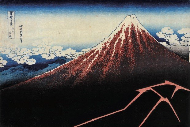
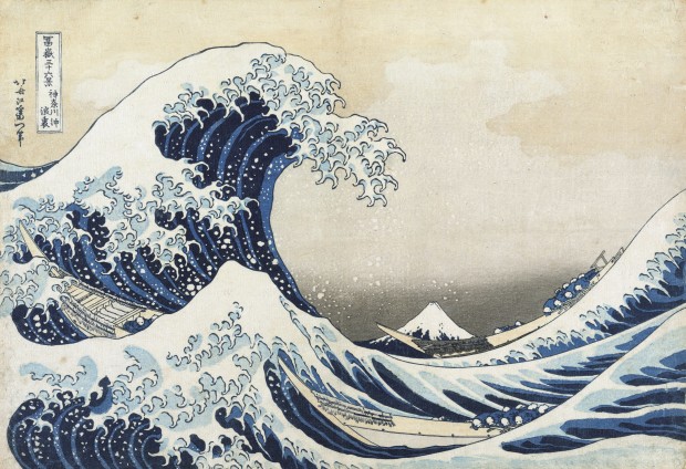
At the break of dawn on an early summer day, a southern wind brushes across the face of Mount Fuji, dyed a deep red for but an instant by the rising sun. The ukiyo-e artist Katsushika Hokusai captures this scene in his print 『冨嶽三十六景 凱風快晴』 (“Thirty-six Views of Mount Fuji: South Wind, Clear Sky”). Commonly known by the name “Red Fuji”, this print is a rarity in the Thirty-six Views of Mount Fuji series. Among the entirety of the series, only two prints depict the sacred mountain from a bird’s-eye view—this print and “Rainstorm beneath the Summit”. These two prints featuring the monumental peak, along with 「神奈川沖浪裏」 (“The Great Wave off Kanagawa”), are masterpieces that helped cement Hokusai’s fame both within Japan and abroad.
 Katsushika Hokusai, 「山下白雨」 (“Rainstorm beneath the Summit”), Sumida Hokusai Museum.
 Katsushika Hokusai’s most famous work: “The Great Wave off Kanagawa” from the Thirty-six Views of Mount Fuji series.
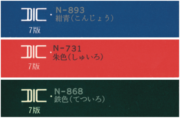
The intense visual impact of “Red Fuji” is, more than anything, due to its color scheme—the surface of Mount Fuji a red, while ribbons of mackerel clouds spread out against a blue sky, and a gradation of green colors the sea of trees below. Despite being a very simple image composed of only 3 colors, the lovely and vivid coloring of this print makes it stand out against other polychrome woodblock prints. It is said that “Red Fuji” was met with astonishment for its bold and clean design.
The transparent blue used to color the summer sky received special attention. During Hokusai’s time, this color was derived from a man-made Persian-blue pigment newly imported from the West and commonly referred to as “Berlin blue”. This nickname comes from the fact that the pigment was manufactured in Berlin. One of the hidden secrets to the beauty of the Thirty-six Views of Mount Fuji series lies in the newfound development and application of this colorant.
These 3 colors amazed the world!
 ※ These color samples were sampled and selected by the Waraku magazine editorial department.
The white cirro-cumulus or mackerel sky clouds contrasted against the expansive, rich field of Berlin blue give the impression of a clear blue sky. In addition, the gradation of blue ink creates atmospheric depth. Meanwhile, the peak of Mount Fuji shows off a brilliant red gradation produced from the rays of the rising sun. Finally, the dense woodlands creeping up Mount Fuji are depicted with a fresh gradation of green ink paired with energetic dashes of dark green to define trees. With these gradations of color, from darker shades to lighter values of the same hue, Hokusai widened his color palette and range of expression. By making full use of printing techniques in the small details of the print, Hokusai has managed to produce an impressive image that resonates with people worldwide.
Translated and adapted by Jennifer Myers.


